Building one product language across mobile, web and enterprise work.
Tarjimly kept growing. Mobile, enterprise, translation workspaces, live interpretation and AI. I built and scaled the design system so we stopped redesigning the same decisions and had a clearer base to build from.
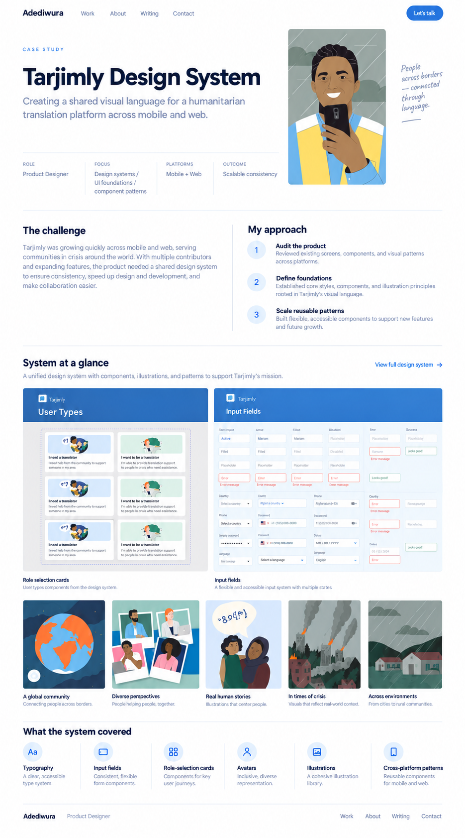
The problem was not a lack of screens. It was repeated decisions.
Tarjimly already had a lot of product surface area. The same things kept coming back: language selection, action hierarchy, inputs, request states, navigation, waiting states and role-specific flows.
I built the system to turn those repeated decisions into shared rules, then pushed those rules back into the product.
I use those numbers to show the scale the system had to support, not as growth caused by the design system.
The product was growing faster than its interaction language.
Earlier Tarjimly work already covered onboarding, account type, language selection, home, session requests, matching, training and profile management. The issue was not that every old screen was bad. The issue was that every new feature created another chance to solve something the product had already solved before.
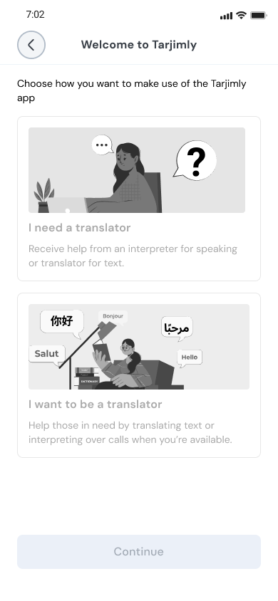
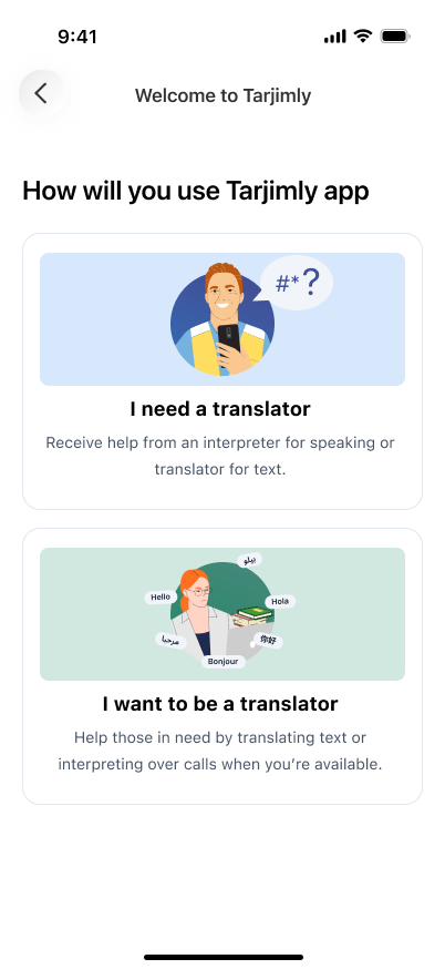
The goal was not to make the old product look newer. It was to stop making the same decisions from scratch.
I built the system from the bottom up.
I started with the decisions that should stay stable, then moved into reusable controls, larger patterns and finally the things that were specific to Tarjimly.
This layering mattered because a new workflow did not automatically need a new component. Often it only needed existing decisions to be composed differently.
A shared visual language before shared components.
The system covers color, typography, spacing, radius, elevation, focus treatment, icons, avatars and illustration. The Tarjimly color collection includes 81 brand variables across nine families. Semantic variables then separate raw values from roles such as primary, foreground, border, input and destructive.
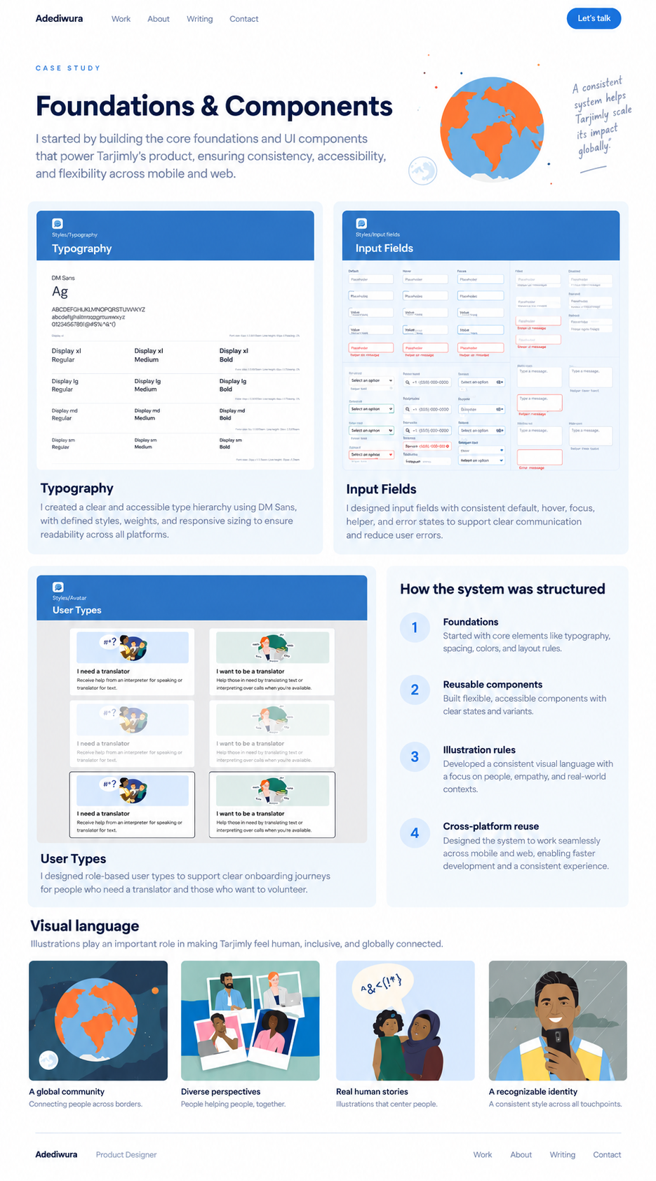
Components describe decisions, not page names.
Buttons were one of the easiest places to test the model. Instead of making a button for signup, another for matching and another for profile, I defined the choices that actually change the component.
| Hierarchy | Primary · Secondary · Outline · Text · Link |
|---|---|
| Icon | No Icon · Icon Only · Leading · Trailing |
| Size | Small · Medium · Base · Large · XLarge |
| State | Default · Hover · Pressed · Disabled |
The full Button matrix supports 320 combinations. The number is not the point. What matters is that the designer chooses the right properties instead of asking for another screen-specific button.
The same thinking carries into inputs, topic selection, filters, session tabs, modals and other product patterns.
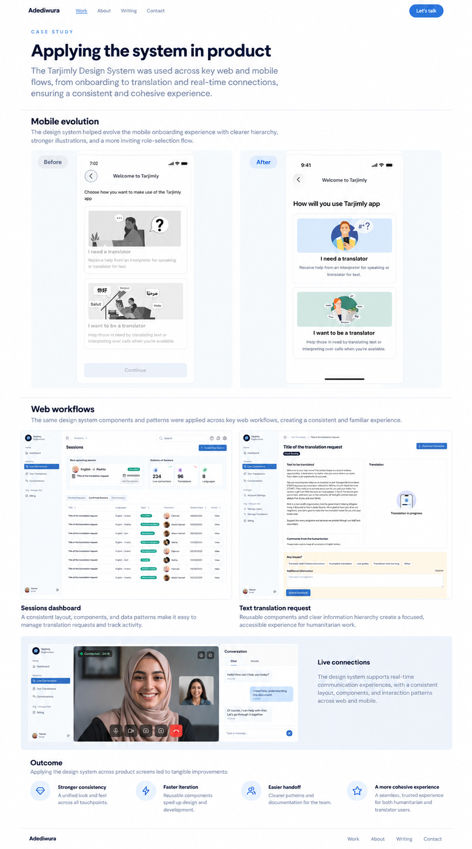
The real test was the service journey.
I used the mobile redesign to test the system across very different states: first-use education, service entry, language selection, request setup and AI-assisted translation.
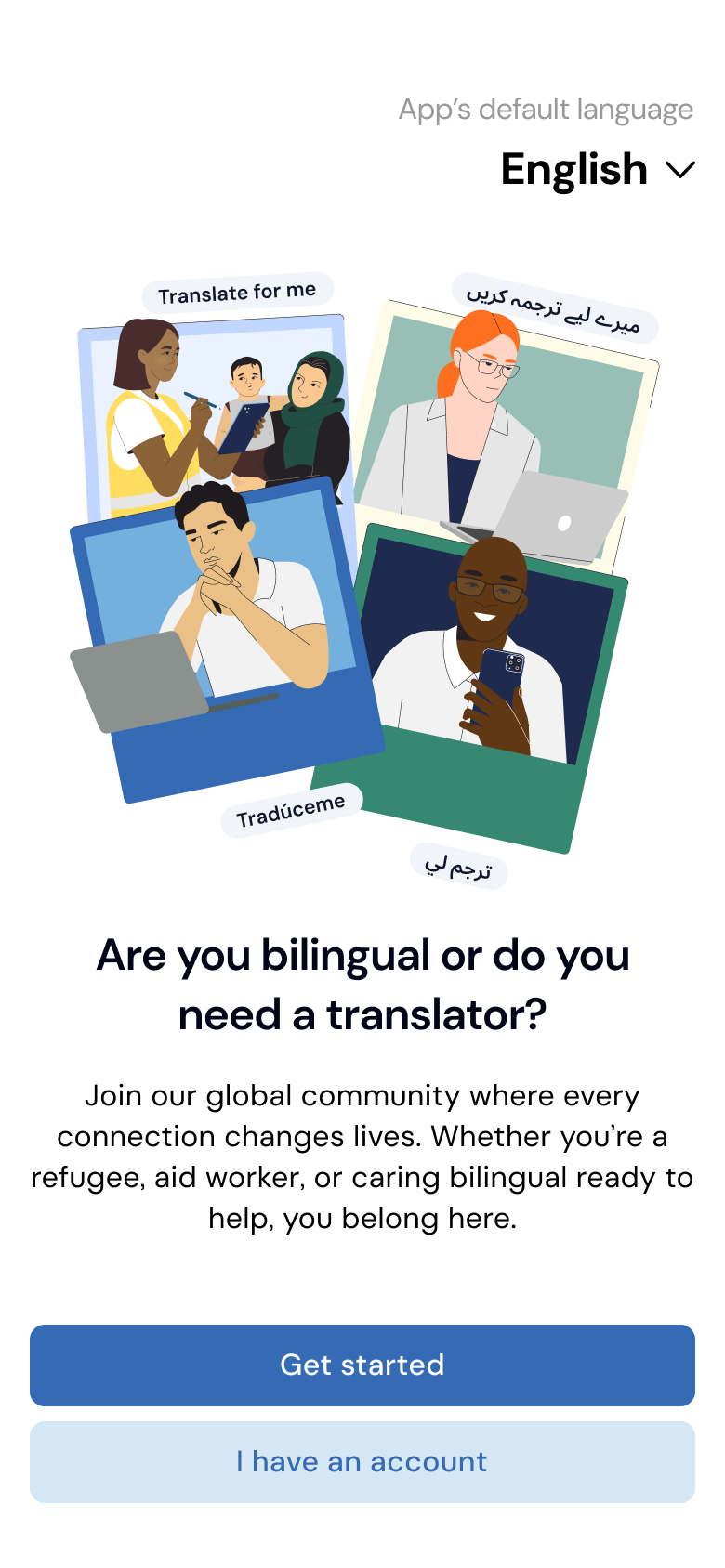
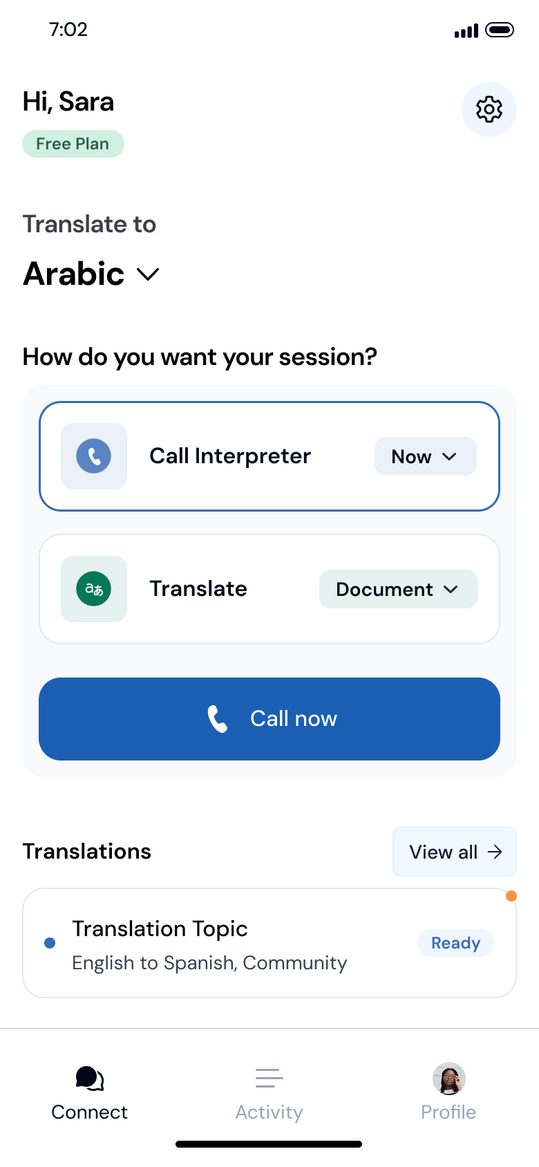
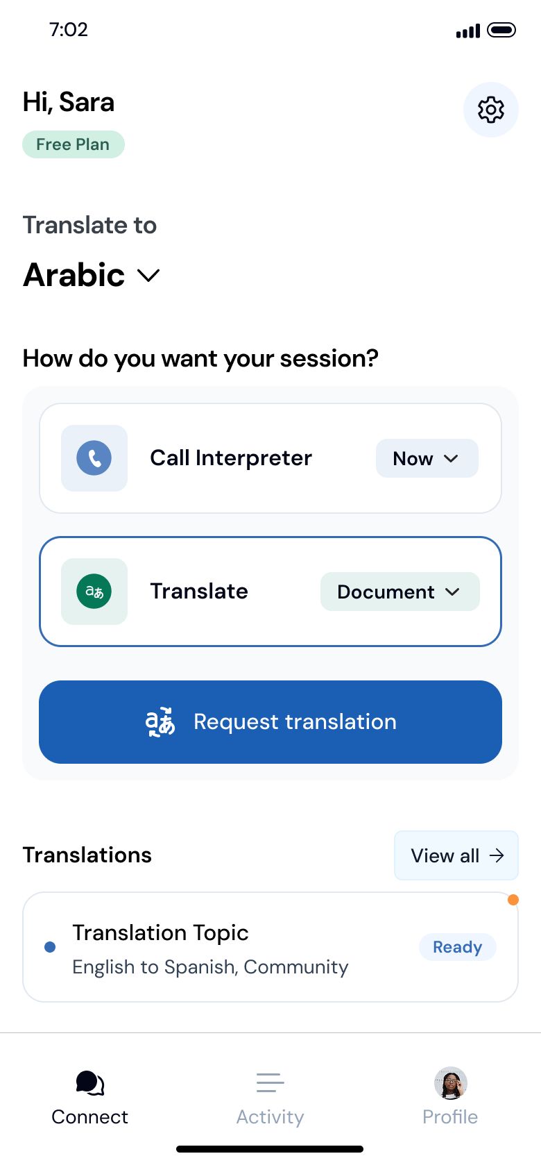
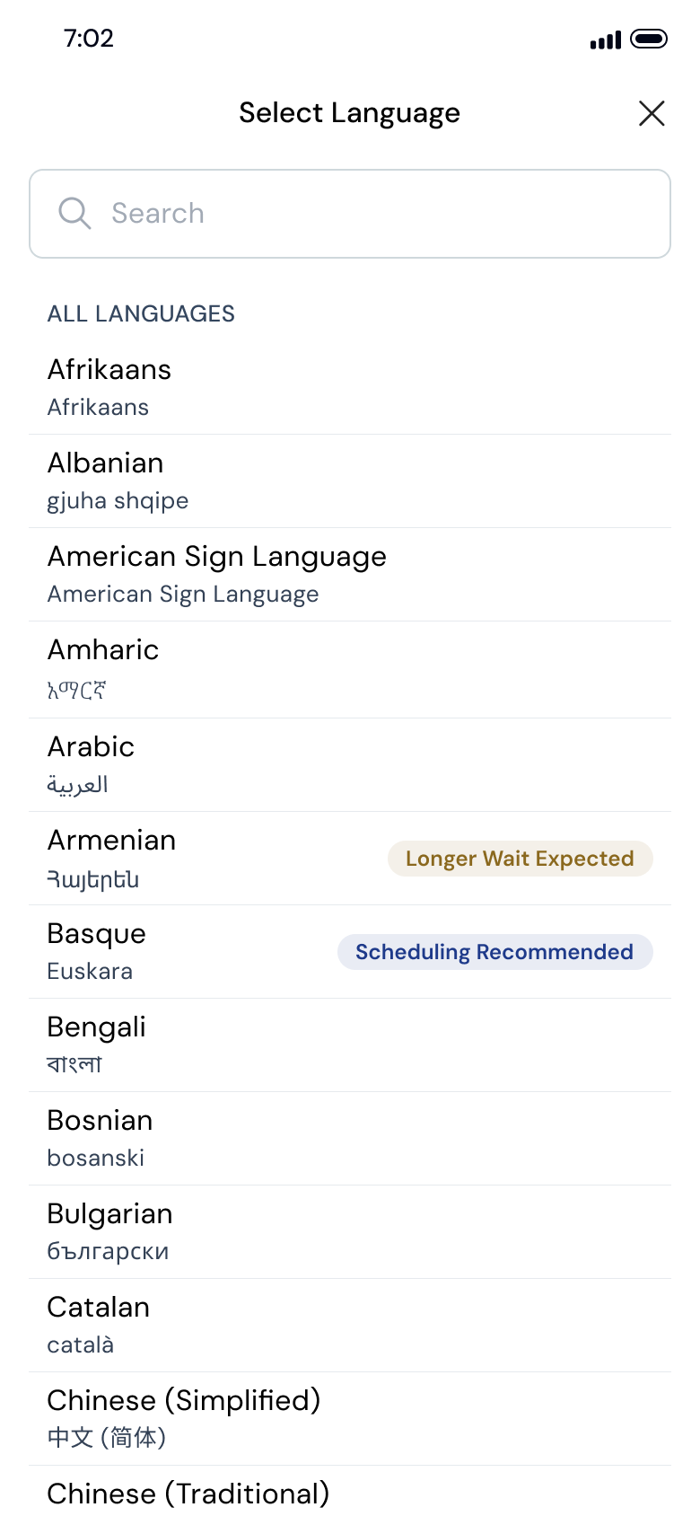
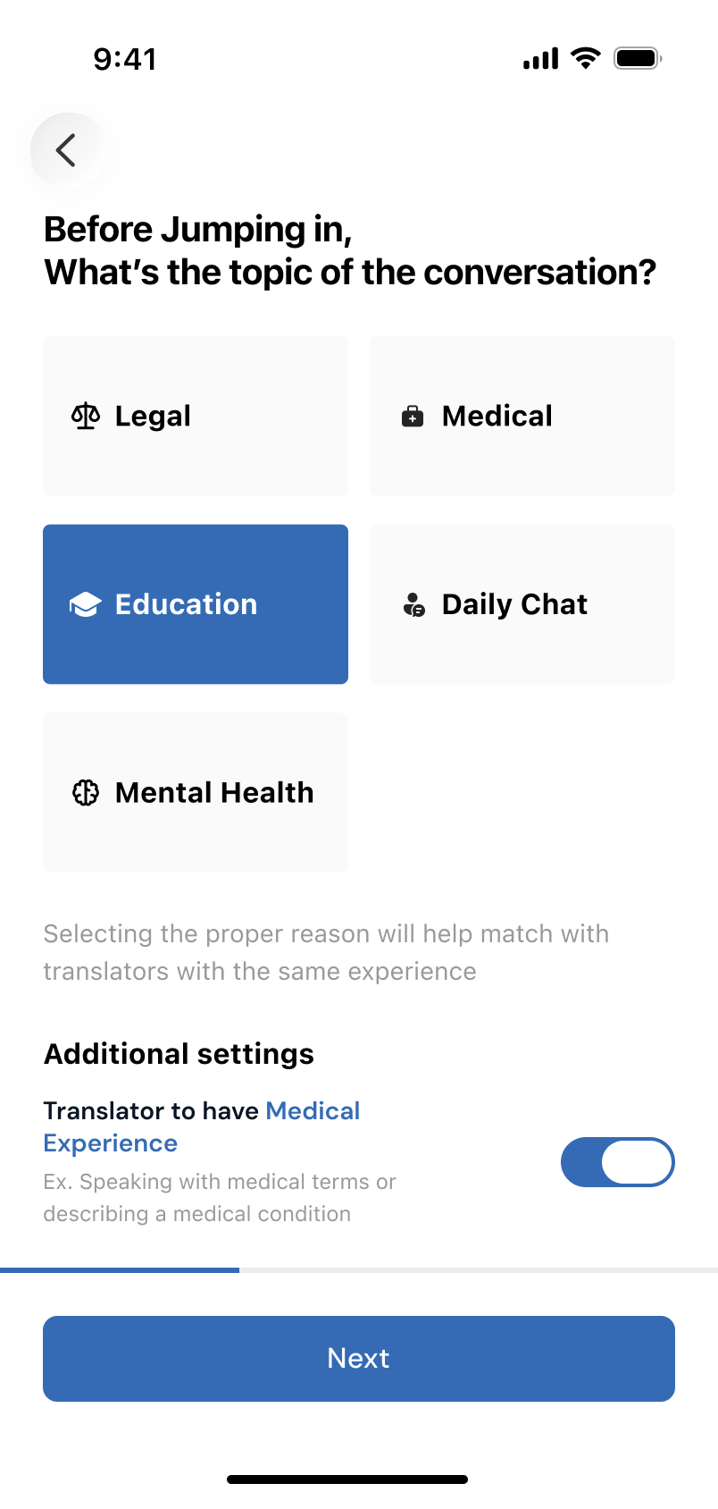
Then AI arrived. I did not want that to create a second product language.
Spark added new capability, but the surrounding product still needed familiar hierarchy, controls, states and handoff behaviour.
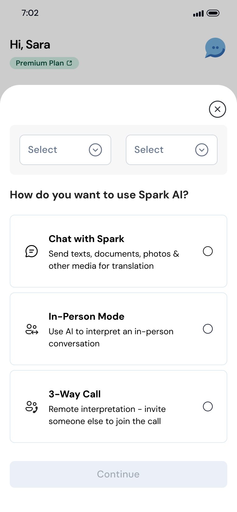
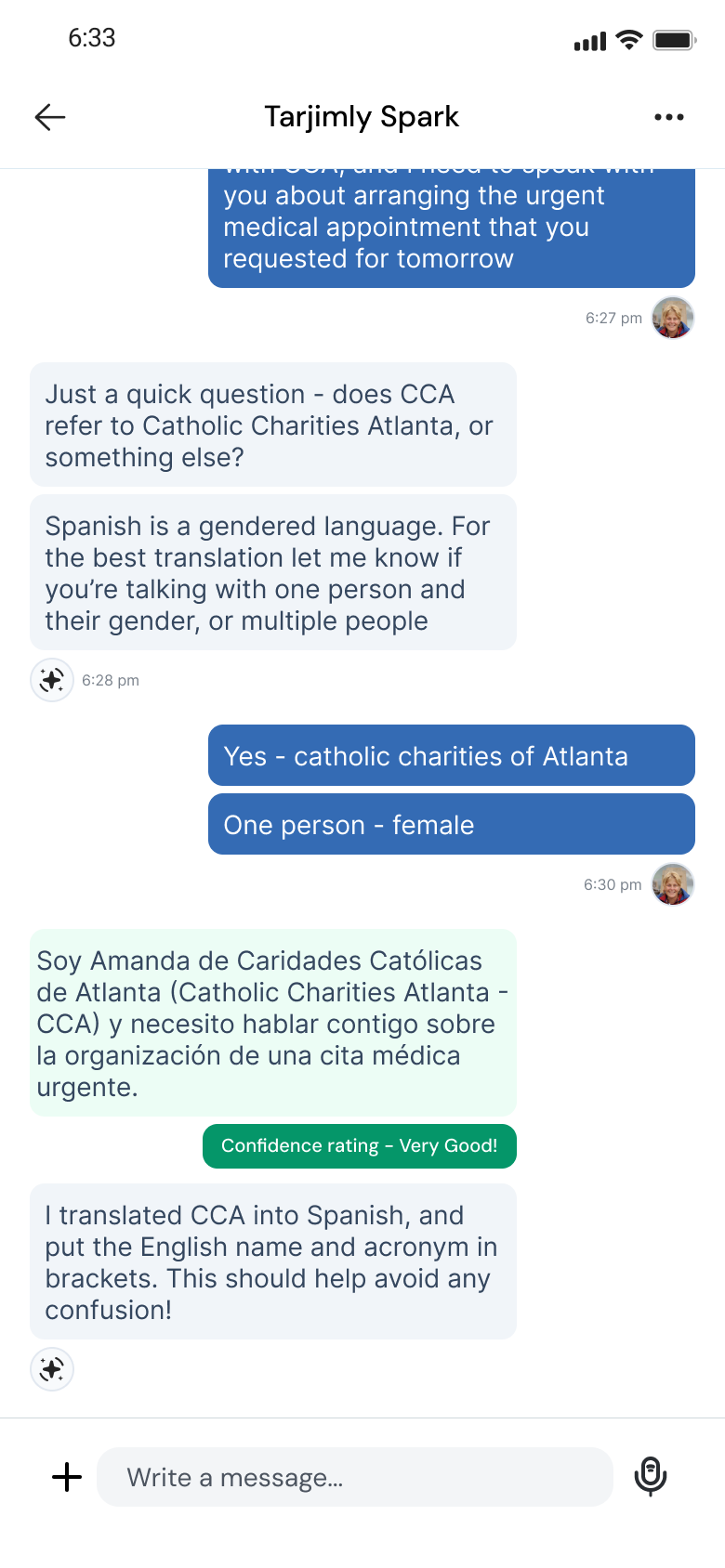
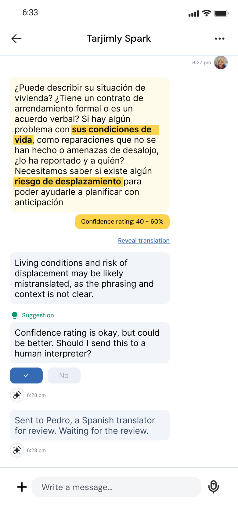
The same system had to survive more information.
Tarjimly Web pushed the system into long-form translation and more operational work. The interface could not behave like a stretched mobile screen. It needed the same foundations and interaction rules, then a denser component layer for the job.
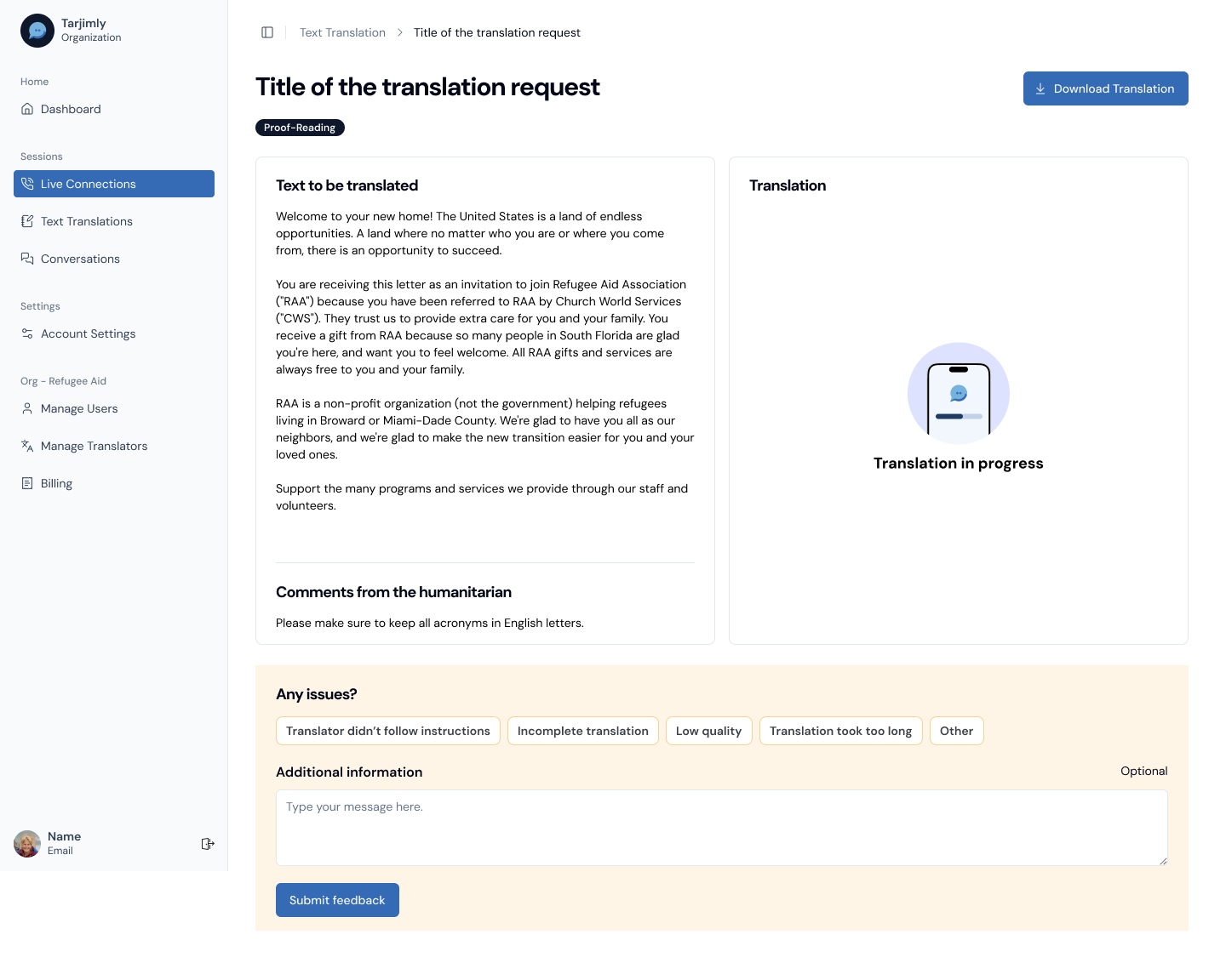
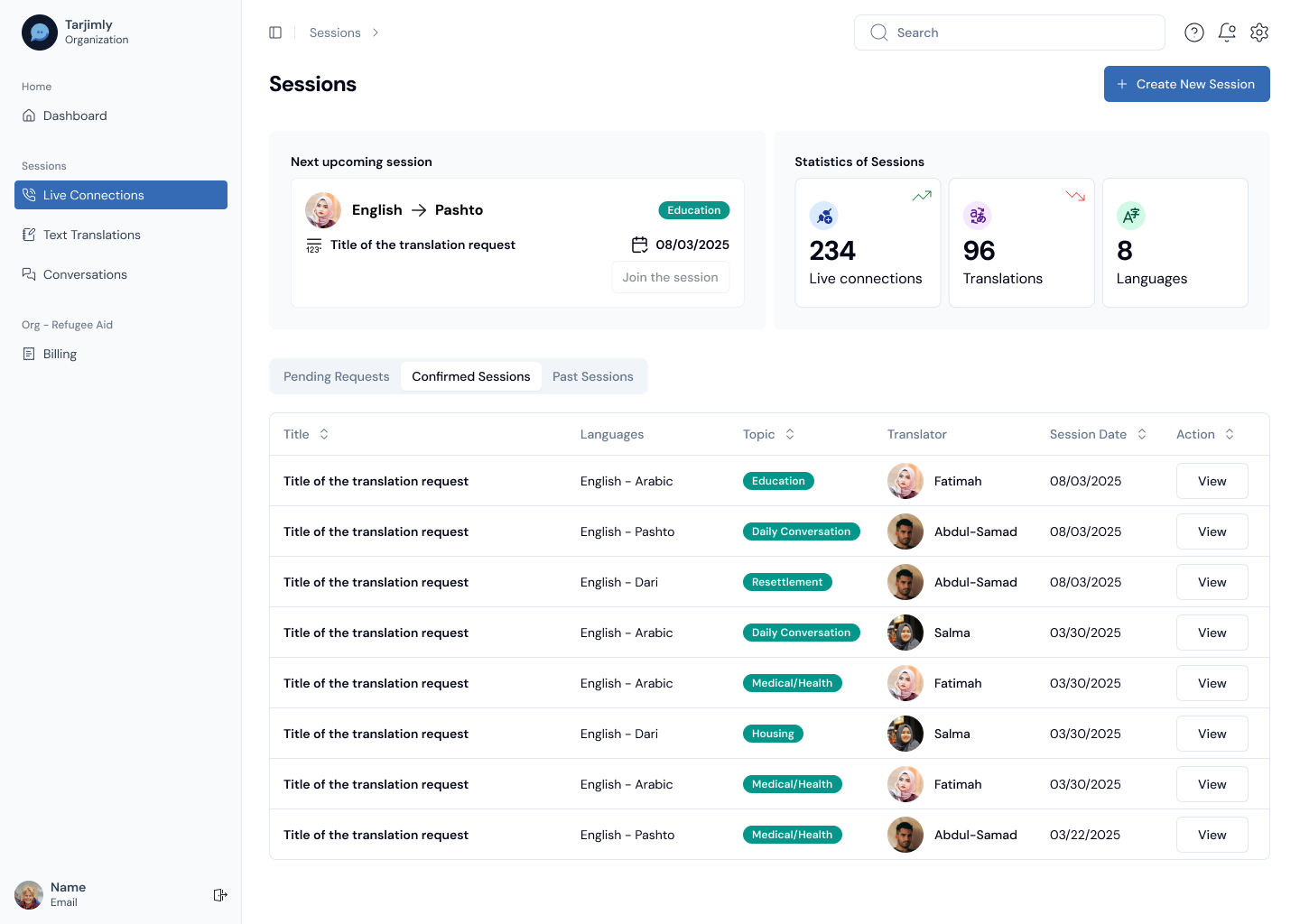
This is where consistency had to mean something deeper than identical layouts. Mobile and desktop could look different while still sharing the same product language.
Reach added another level of operational complexity.
Reach brought in enterprise navigation, request operations, status-heavy lists and live interpretation. The system expanded to support those needs without pulling the product away from Tarjimly’s core interaction language.
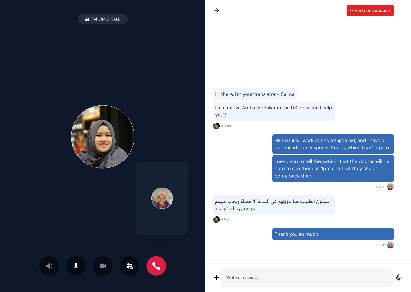
That was the principle I kept coming back to: consistency without sameness. Give each surface the patterns it needs, but do not make users or teams relearn the product every time the context changes.
The system moved from a library into product infrastructure.
The product files show broad reuse across real work. On the Tarjimly Web V1 Updates page alone I found 609 table-cell instances, 148 Buttons, 112 Avatars, 74 Badges, 71 Sidebar Items, 58 Table Headers, 19 Tabs, 17 Inputs, 15 Selects and 14 Toggles.
These are design-file composition counts, not production adoption metrics.
I also do not attribute Tarjimly’s 700K+ users or 1,300+ organisations to the design system. The system-specific outcome is narrower: a more consistent interaction language across mobile and web, and a clearer shared reference for design and engineering.
Creating components builds a library. Maintaining shared decisions builds a design system.
The next stage would be less about adding components and more about governance: ownership, naming, versioning, deprecation, contribution rules, adoption measurement and stronger design-to-code mapping.
The library also shows places where naming became less consistent as it expanded. That is useful learning too. At a certain size, governance becomes as important as component creation.