Designing a Scalable Healthcare Platform for Patients and Providers
I led product design for a telemedicine ecosystem that connected patients, doctors, pharmacies, hospitals and internal operations teams through web and mobile products.
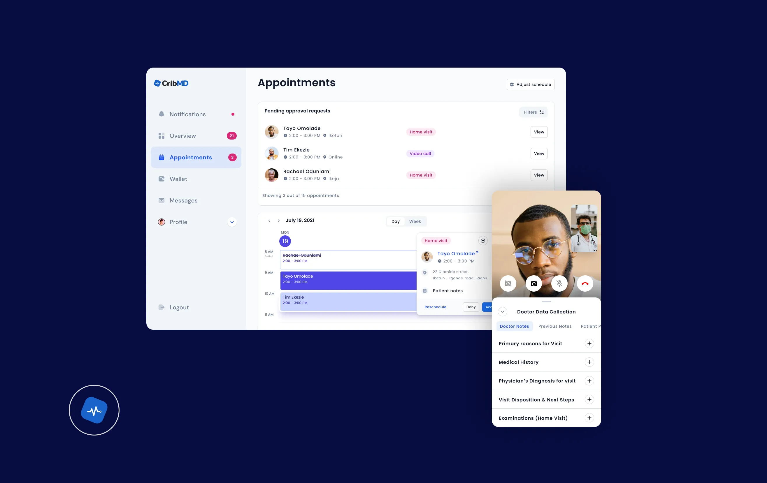
I led product design for CribMD's telemedicine ecosystem — redesigning the patient booking flow, doctor experience, admin operations and design system. The redesign increased booking completion from 28% to 47%, reduced booking time by 22%, cut support tickets by 20% and reduced doctor clarification time by 40%.
The Challenge: Healthcare Access Was Broken
The Patient Problem
Long and unpredictable wait times for medical care
Confusing booking processes with high cognitive load
Low trust in digital consultations
The Provider Problem
Disconnected tools for scheduling, video, and billing
High administrative overhead draining productivity
Constant context switching during care delivery
Baseline Metrics (Before Redesign)
62% drop-off before doctor selection
28% booking completion rate
3-5 minutes wasted per consultation clarifying basic info
The Approach: System Design Over Isolated Screens
Instead of jumping into screens, I mapped the system end-to-end. I broke the experience into three interconnected layers that work together as a cohesive ecosystem.
Access Layer
Onboarding, discovery, and booking flows designed to reduce friction and create immediate momentum.
Interaction Layer
Consultations and messaging systems that prioritize care quality and real-time communication.
Operational Layer
Scheduling, finance, and records management that eliminate administrative overhead.
Key Decisions: Redesigning the Booking Flow
Booking sits at the intersection of speed (user expectation) and accuracy (clinical need). Optimizing one often breaks the other.
"Users don't resist giving information. They resist giving it too early."
Step 1: Problem Framing
Users select what they need help with, reducing decision anxiety and creating immediate momentum.
Impact: +18% increase in progression rate
Step 2: Smart Filtering
Users see only relevant doctors based on their selected issue, removing unnecessary choices and speeding up decision-making.
Impact: Doctor selection rate improved from 41% to 63%
Step 3: Commitment Point (Time Selection First)
Users pick a time before entering details. This creates psychological commitment: "I've started booking - I'll finish this."
Impact: Completion rate after this step reached ~82%
Step 4: Context Collection
Users provide medical details after committing: symptoms, allergies, and image uploads. This shifted the experience from "filling a form to see a doctor" to "starting care immediately."
2.3× increase in symptom submissions
1.8× increase in image uploads
~40% reduction in doctor clarification time
Provider Experience: Reducing Doctor Workload
Scheduling System
Recurring availability management
In-app rescheduling
Daily workload visibility
Integrated Consultations
Video calls inside the platform
Patient context visible during sessions
Financial Dashboard
Earnings tracking
Transaction history
Direct withdrawals
Outcomes
Reflection
CRIBMD taught me that healthcare UX is not just about patient screens. It is about designing the full system around access, trust, provider workload and operational clarity.
The redesign helped reduce support burden, improve the usability of virtual care experiences and create a more consistent product foundation for patients, providers and internal teams.
Visit CribMD