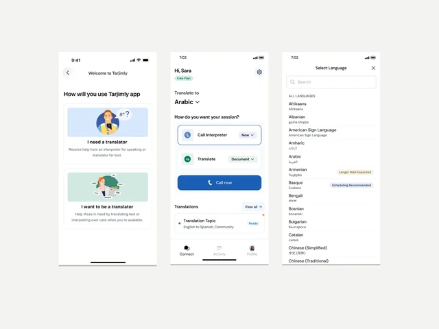
One system, different product surfaces.
The same system had to support simple mobile journeys, live interpretation and denser enterprise workflows without making every product look the same.
The goal was not just to build a component library.
Tarjimly had grown into several connected products for people requesting language help, translators, humanitarian organisations and enterprise teams.
My job was to stop the team solving the same UI decisions repeatedly. The system needed to improve consistency and reuse while still supporting the differences between mobile, web and enterprise workflows.
The same UI decisions were being solved repeatedly.
Tarjimly already had onboarding, language selection, home screens, session requests, matching, profiles, training and settings. The screens were different, but many of the interaction decisions were the same.
Language selection, actions, forms, status, navigation and request details kept coming up again. I wanted those decisions to be reusable instead of redesigned each time.
Before and after: the same decision, handled more consistently.
The point of this comparison is not that the old screen was bad. The decision stayed the same; the new system made the hierarchy and behaviour more consistent.
I built the system in layers so it could grow without creating a new component for every feature.
I started with foundations, then primitives, components and Tarjimly-specific product patterns.
Foundations
I separated brand values from semantic UI roles so colour, type and states could be used consistently across products.
Components solved repeated product decisions, not individual screens.
Buttons were organised by hierarchy, icon use, size and state. Inputs kept the same structure across text, passwords, selectors, language fields, helper text and errors.
The mobile app shows how the system works in real product flows.
These screens show the system across onboarding, service entry, language selection, request setup and Spark AI states.
Together, they show how the same system works across onboarding, transactional flows and AI-assisted translation.
Onboarding
Onboarding explains the product before asking the user to commit.
Service entry
The home screen keeps the main service choice clear while keeping language context visible.
Translation entry
Translation uses the same interaction language without needing a separate visual system.
Language selection
Language selection became a reusable pattern instead of a one-off screen.
Request setup
Topics and translator requirements became reusable patterns because they directly affect matching and service quality.
Spark modes
Spark reuses the same product language while adding AI modes and status states.
Spark clarification
When the AI is unsure, it can ask for clarification instead of acting certain.
Spark review handoff
When confidence is lower, Spark shows the issue and gives the user a clear path to human review.
These screens come from the Tarjimly mobile redesign and show how the system behaves inside real product states.
The real test was whether the system worked inside complete product flows.
I tested the system across onboarding, service entry, request setup, translation work and denser operational interfaces.
Consistency did not mean making mobile and enterprise identical.
Reach has denser information, operational actions and live interpretation. It keeps the shared foundations but uses patterns that make sense for enterprise users.
The system supported Tarjimly as the product grew.
The system supported products serving 700K+ users and 1,300+ organisations across mobile and web. I use those numbers to show product scale, not to claim the design system caused that growth.
The outcome I can support directly: Better consistency across Tarjimly’s mobile and web products, with clearer handoff between design and engineering.
A component library is only useful if the decisions behind it stay consistent.
What I would take further
The next step would be stronger governance: ownership, contribution rules, naming, versioning, deprecation, adoption tracking and better design-to-code mapping.
As the library grew, naming became less consistent in places. That showed me that governance becomes just as important as adding new components.