The problem
The Patient Problem
Long and unpredictable wait times for medical care
Too many decisions before booking
Low trust in digital consultations
The Provider Problem
Disconnected tools for scheduling, video, and billing
High administrative overhead draining productivity
Constant context switching during care delivery
Baseline Metrics (Before Redesign)
62% drop-off before doctor selection
28% booking completion rate
3-5 minutes wasted per consultation clarifying basic info
I mapped the full care journey before redesigning screens
I mapped the full experience first, then grouped the work into three connected layers.
Access Layer
Onboarding, discovery and booking. The goal was to get users to a clear next step quickly.
Interaction Layer
Consultations and messaging, with patient context kept visible during care.
Operational Layer
Scheduling, finance and records, with less admin work for providers and internal teams.
Key Decisions: Redesigning the Booking Flow
Booking had to be fast without losing the medical information doctors needed.
"Users don't resist giving information. They resist giving it too early."
Step 1: Problem Framing
Users first choose what they need help with, so the next step is easier to understand.
Impact: +18% increase in progression rate
Step 2: Smart Filtering
Users only see doctors relevant to the selected issue, so there are fewer choices to sort through.
Impact: Doctor selection rate improved from 41% to 63%
Step 3: Commitment Point (Time Selection First)
Users chose a time before entering medical details. That gave them a clear sense of progress before the heavier form fields appeared.
Impact: Completion rate after this step reached ~82%
Step 4: Context Collection
After choosing a time, users added symptoms, allergies and images. The form now felt like part of completing the appointment, not a barrier before booking.
2.3× increase in symptom submissions
1.8× increase in image uploads
~40% reduction in doctor clarification time
Provider Experience: Reducing Doctor Workload
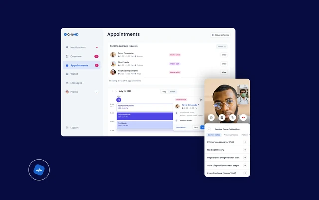
Scheduling System
Recurring availability management
In-app rescheduling
Daily workload visibility
Integrated Consultations
Video calls inside the platform
Patient context visible during sessions
Financial Dashboard
Earnings tracking
Transaction history
Direct withdrawals
Product Micro-interactions
I used Lottie for micro-interactions across booking, appointment, consultation and system states. This included loading, confirmations, call status, form completion, success and error feedback.
Tool · Lottie
Patient Experience
This sequence shows appointment, discovery and consultation states across the patient experience.
Booking & Appointment Continuity
This sequence shows booking, doctor selection and scheduled care.
Web & Operational Surfaces
This sequence shows web and operational workflows for clinicians and internal teams.
Reflection
CRIBMD taught me to look beyond the patient screen. The experience also depends on the doctor workflow, operations and what happens before and after a consultation.
The redesign reduced support burden and made the care experience more consistent across patients, providers and internal teams.